Living Room Design Reveal!
The time has come for a first peek at our living room design! When we started thinking about the design of our home, I knew I wanted help from an expert. Sure, I love interior design and think I am fairly good at it. BUT! I knew pulling the design of a larger space and being able to mix styles the way I was hoping to was a job for a professional. Kim Domanski, please enter the chat!!!
I knew I wanted Arhaus pieces in our new home. The quality is unmatched and the style of their pieces spans across so many different tastes. The coolest thing about buying Arhaus furniture though? No matter how big or small the project, you are able to work with their design team to bring your vision to life. Um.. SOLD.
We worked with Kim, a local designer to Chicago who we loved instantly. We chose to work with our designer both virtually and in person, however, you can also make this process completely virtual if you don’t have a designer in your area of prefer to do so! She was so sweet and receptive on our first call. I was worried that with all the things both Sam & I wanted + our different styles, pulling something together that we both loved was going to be tough- boy was I wrong. We were THRILLED with the first round of designs and by round two, there were only tiny details to adjust. Below is our first round of renderings Kim delivered (also can we talk about how cool it is to see the space rendered like this! Technology, man)!
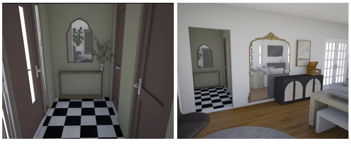
ENTRY
Round one design
We loved the idea here- as you know, I’m afraid of color so we nixed the green entry and swapped out the mirror for a different one, which we then ended up switching out for a piece of art. Sam’s biggest request was having a dedicated place in the living room for music. The record player needed a home and Kim DELIVERED on that. She chose the Hattie Sideboard which the record player will sit on top of. It’s perfect because the glass fronts mean our records will get to be on display which is perfect. We loved the big mirror but didn’t love gold for the space so we swapped the mirror for the black version and that pulled it all together!
HERE IS WHERE WE ENDED UP!
Round two design
LIVING
Living Round One
When you first walk into our home, we have a set of three bay windows which lead you into a long, narrow living space. We really didn’t know how to fill this space and we were pretty stumped by it. Layout was perfect round one. Dividing the room with the Sullivan Console at the back of the couch was the perfect way to break up a long narrow space.
Design one started with a library + gallery wall which we loved. However, we decided to simplify! In the end, we will do 1-2 oversized pieces of art which I’m going to attempt (maybe) to DIY. We kept the same layout on the rest of the space but adjusted a bit!
HERE IS WHAT WE ENDED UP WITH!
A few other subtle changes have been made & some details you can’t see in renderings so I will leave some surprises! For the most part, this is our living room, ya’ll!!! Here is a birds-eye view of the space to put the cherry on top! Using the Arhaus design services were a dream. I never knew we could have so many options to customize our pieces and our space. I can’t recommend working with them enough!! Thinking about bringing this space to life brings tears to my eyes. Kim, thank you for being the BEST to work with. We can’t wait to have you over to see the space!!!


